|
 |
Home > Company > CI |
| |
 |
| |
 |
 |
| |
| |
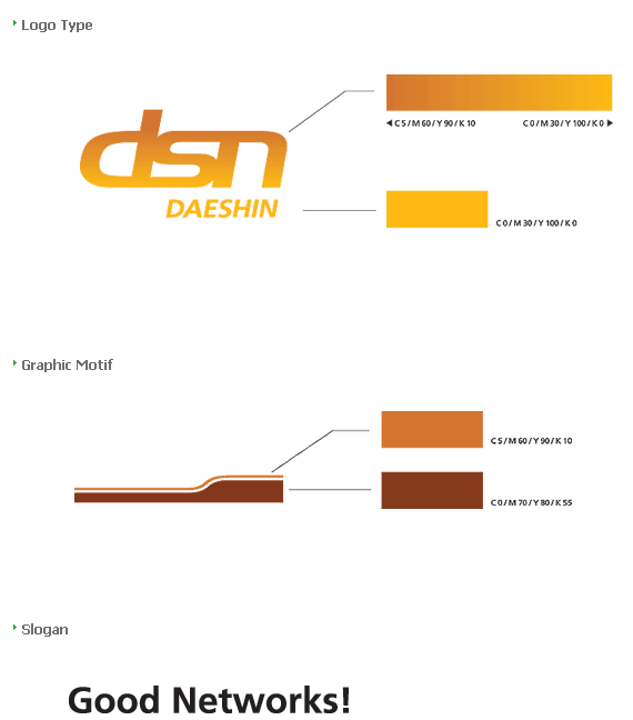
Daeshin Network's English initial is DSN, and under the concept "beyond networ," we represented with the keyword, "connection." It is representative of our goal of achieving network of business through "connection" sand it also represent unique characteristic of independent 28 network agencies nationwide. Moreover, it symbolizes the close networking with our customers. Similarly, it embodies the togetherness of Daeshin workforce as well as representing great scale of nationwide agencies of Daeshin |
| |
|
 |
| |
Daeshin`s main color, orange, represents our aim of achieving warm human-centered business values, as well as symbolizing the unlimited potential, safeness, and warm appreciation and interaction with our customers. Moreover, the gradual changes in the colors represent Daeshin's commitments to being a leader in IT industry and its flexibility in adapting to fast changing corporate environment. |
| |
 |
| |
| |
 |
 |
| |
|
|

